martes, 27 de noviembre de 2012

Redes de amor adolescente


Love is a Battlefield Spanning-Tree Network with no 4-Cycles

by KIERAN HEALY


Quick, in high school were you ever told not to date your old girlfriend’s current boyfriend’s old girlfriend? Or your old boyfriend’s current girlfriend’s old boyfriend? Probably not. But I bet you never did, either. This month’s American Journal of Sociology has a very nice paper (subscription only, alas) by Peter BearmanJim Moody and Katherine Stovel about the structure of the romantic and sexual network in a population of over 800 adolescents at “Jefferson High” in a midsized town in the midwestern United States. They got a pretty well-bounded population (a high school included in the AddHealth study) and mapped out all the connections between the students. Read on for the lurid details.
The authors found that the observed network isn’t well-represented by existing models, which are mainly concerned with predicting how STDs propagate through populations and have often been based on ego-centered network data. These are surveys where you ask the respondents about their sexual networks, but the respondents aren’t necessarily in the same network. Here’s a picture of four kinds of network:

Core models posit a small group of very sexually-active individuals who occasionally come into contact with (and infect) those outside the core. Bridge models think in terms of an infected component and an uninfected component which join at some point. The biggest network component observed at Jefferson High turned out to be the fourth type, however: a “spanning tree” structure. This is “a long chain of interconnections that stretches across a population, like rural phone wires running from a long trunk line to individual houses … characterized by a graph with few cycles, low redundancy, and consequently very sparse overall density.” When they tried to simulate this bit of the graph structure, the authors found they could get most of the way there using a simple model where the probability of a tie depended on individuals having a preference for others with the same amount of sexual experience as themselves.[1] But simulated networks based on this model didn’t quite match the properties of the observed network. In particular, while the simulations had cycles of length 4, the Jefferson High network did not.
What’s a cycle? If you start at Crooked Timber and click over to Dan Drezner and then click Dan’s link to Mark Kleiman and then return to Crooked Timber via Mark’s link to us, you’ve completed a cycle of length 3: a walk through the network that starts and ends with the same actor and where all the other actors are different and not repeated along the way. Cycles of length 3 are the smallest possible cycles. When it comes to tracing paths through heterosexual relationships, though, the smallest possible cycles are of length 4. In order to make a cycle beginning and ending with yourself, you need two members of the opposite sex plus one intervening individual the same sex as you. It turns out that this kind of cycle is just not found in the Jefferson High network. Although there’s no explicit taboo or social norm against that kind of pattern, nevertheless people just don’t date their old partner’s current partner’s old partner.
From the perspective of males or females (and independent of the pattern of “rejection”), a relationship that completes a cycle of length 4 can be thought of as a “seconds partnership,” and therefore involves a public loss of status. Most adolescents would probably stare blankly at the researcher who asked boys: Is there a prohibition in your school against being in a relationship with your old girlfriend’s current boyfriend’s old girlfriend? It is a mouthful, but it makes intuitive sense. … For adolescents, the consequence of this prohibition is of little interest: what concerns them is avoiding status loss. But from the perspective of those interested in understanding the determinants of disease diffusion, the significance of a norm against relationships that complete short cycles is profound. The structural impact of the norm is that it induces a spanning tree, as versus a structure characterized by many densely connected pockets of activity (i.e., a core structure).
Individuals constitute social structures, yet those structures have properties that the members do not know about and can’t easily grasp—our vast amount of folk knowledge about our social relations notwithstanding. These properties can have all kinds of serious consequences. The “No 4-cycles” rule is interesting because on the one hand it reflects a very simple bit of structure and it’s not something that’s prohibited in any strong normative sense. I’m not sure I buy the authors’ status-based explanation for it, though. They suggest some alternatives—“’jealousy’ or the avoidance of too much ‘closeness,’ a sentiment perhaps best described unscientifically as the ‘yuck factor.’” I find the yuck-factor idea more intriquing: I wonder whether it’s more likely to show up at the limits of easily-described network structures. Bigger cycles defy easy verbal description altogether and are also subject to lack of information because some of the ties will be in the past or far away, so they’re not subject to avoidance. Dyadic ties are easy to keep track of. Short cycles are still tricky to grasp, but it’s not that hard, so being able to trace them triggers the taboo-like “yuck” response.
As for consequences, the spanning-tree structures created by experience homophily plus the 4-cycle rule are very effective at propagating diseases along their chains. But they are also easy to break in a way that core-type networks are not:
Under core and inverse core structures, it matters enormously which actors are reached, while under a spanning tree structure the key is not so much which actors are reached, just that some are. This is because given the dynamic tendency for unconnected dyads and triads to attach to the main component, the structure is equally sensitive to a break (failure to transmit disease) at any site in the graph. In this way, relatively low levels of behavior changeeven by low-risk actors, who are perhaps the easiest to influence can easily break a spanning tree network into small disconnected components, thereby fragmenting the epidemic and radically limiting its scope.
fn1. Homophily, or the tendency do associate with others with similar traits to oneself, is a powerful social force that explains a great deal about the structure of social networks—in this case, homophily on experience.

Crooked Timber

Influencia en comunidades


Community Influencers Step by Step

by  


michaelwu.jpgMichael Wu, Ph.D. is Lithium's Principal Scientist of Analytics, digging into the complex dynamics of social interaction and online communities.

He's a regular blogger on the Lithosphere and previously wrote in the Analytic Science blog.

You can follow him on Twitter at mich8elwu.


Suppose you need to find the influencers for your brand in a community, how would you go about doing this? What kind of data do you need, and where do you start? Good question, today I am going to show you, step by step, how to find influencers in anonline community. I will use Lithium’s own online community, Lithosphere, in the following example, but you can do the same with any social media platform.

1. Identify the Necessary Data
From my earlier post “Finding the Influencers,” we know that an influencer must have high bandwidth and be credible. For finding high bandwidth users, our platform tracks participation velocity data for each user, and also collects a variety of social equity data. Our community platform also allows users to specify friends in the community. However, this feature is more common in enthusiasts’ communities than in other types of sites, so we have only a small amount of data to construct the friendship graph.

For finding credible users, we have reciprocity data (e.g. kudos and accepted solutions) and reputation data from our reputation engine. However, because our community platform does not require users to build an extensive user profile, we do not have self-proclaimed data on interest and expertise. As mentioned above, we probably do not have enough data to construct a reliable friendship graph, but friendship graph is less useful for finding credible users anyway. Since our community is a highly interactive platform with many topic-specific conversations among users, we can build a topic-specific conversation graph from the conversation data. Social network analysis (SNA) can then be applied to this social graph to accurately identify influencers.

From our analysis, we can see that our community platform has plenty of data for finding influencers, and we can pick and choose what data we would like to use. This may not be true on other platforms or other social media channels. As Philalluded to in his post, I took the SNA approach because it allows us to identify influencers reliably -- furthermore, it allows us to identify different types of influencers (see Are all Influencers Created Equal?).

2. Build the Relevant Social Graph
Most of the conversations in a branded community will already be focused around the brand, so they are likely all relevant. This eliminates the need to filter out irrelevant content. However, to ensure temporal relevance (i.e. timing), we still need to filter out temporally irrelevant (i.e. old) content before we build the conversation social graph. To do this, I filtered out all conversations that are older than one month and use only the data within this one month window.

Within this relevant time window, I built the social graph by connecting two users if they have participated in a common conversation. So the relationship that is represented by the edges is co-participation in a conversation (recall that this edge relationship is the most important thing to keep in mind when reading social graphs). The conversation can be a thread in a forum, a blog article or an idea via comments. I also did something more sophisticated by computing the strength of connection between the two users, which is determined by three factors.
  1. The connection strength in a conversation is proportional to the number of messages a user contributed to a conversation. The more messages they contribute, the more likely they will be seen and remembered.
  2. The connection strength in a conversation is inversely proportional to the number of unique participants in the conversation. If there are more participants, then each user is less likely to be remembered.
  3. The connection strength is then summed across all the conversations where the two users have co-participated. The more conversations a pair of users co-participated in, the stronger the connection between them.

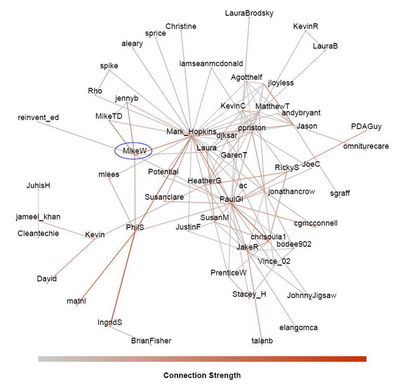
The result is the conversation graph shown here. The data is from Lithosphere for the one month period between 2010-03-05 and 2010-04-05. I labeled the users with their screen name. I can see myself, MikeW, and see that I’ve co-participated in conversations with seven other Lithosphere members (Mark_Hopkins, jennyb, MikeTD, reinvent_ed, Laura, PhilS, and PaulGi).

lithoSocGraph_resize.jpg

Since I have the connection strength between users, I could also filter out weak connections if necessary (when there are too many conversations in a community and the social graph becomes too cluttered to read). In this case, I didn’t need to do this because Lithosphere is still a small community; there were only 57 registered users co-participating in conversations within the one month period of interest. However, keep in mind that this does not mean that only 57 users posted. A user can post, but if no one replies, then there is no co-participation.

3. Social Network Analysis of the Conversation Graph
Once the social graph is built, the ‘hard work’ is done. The rest is number crunching using SNA and interpreting the results. SNA analyzes the social graph and computes node metrics that rank the importance of each user in the network. However, there are many ways that a user can be important. Some are well connected (have many connections), some are reputable (recognized by other important people), yet others may still be important in subtle ways. So SNA actually computes a series of node metrics depending on how we want to measure importance.

Currently, I’ve implemented 10 different such node metrics:
  1. Degree Centrality: How connected a user is, (depending on the edge relationship, this centrality measures the number of connections of a user -- friends, colleagues, etc.)
  2. Eigenvector Centrality: How reputable and recognized is a user
  3. PageRank Score: How much of an authority the user is (this is the same algorithm that Google uses to find authority web pages on the Internet)
  4. Potential reach: How many people can the user reach within two degrees
  5. Clustering Coefficient: How cliquish is the user (the probability that two of your friends are also friends with each other)
  6. Betweenness Centrality: How critical is the user for information diffusion
  7. Core Number: How central is the user in the network
  8. Vertex Eccentricity: How far away from the center is the user
  9. Closeness Centrality for the connected components: How close the user is to the rest of the connected component of the network
  10. Closeness Centrality for all components: How close the user is to the entire network, including disconnected components

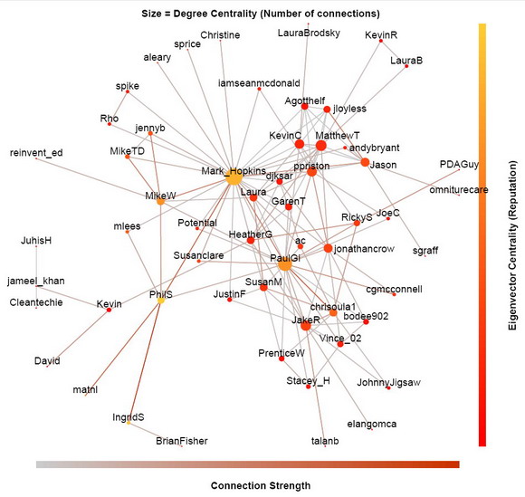
You do not have to know all of them, but you should try to understand the common ones, such as degree centrality, Eigenvector centrality, PageRank score, and potential reach. I can overlay these node metrics on the social graph by mapping them to the size and color of the vertices, so we can visually see these metrics along with the social graph.

lithoSocGraph_degree+eigenvector_resize.jpg

In the above social graph, I map the degree centrality (connectedness) to the size of the dots, and the eigenvector centrality (reputation) to their color. Clearly, Mark_Hopkins has the most connections as indicated by the biggest dot. However, PhilS is the most reputable as indicated by the most yellow color, even though he only talked to six users in that period. Although Mark_Hopkins, PaulGi, IngridS and I are not too far behind on the eigenvector centrality scale, the reason that PhilS is more reputable is because he has strong connections with other users (indicated by the brown edges) and that he is connected to a lot of other reputable users. Remember, how connected a user is does not necessarily correlate with his reputation.

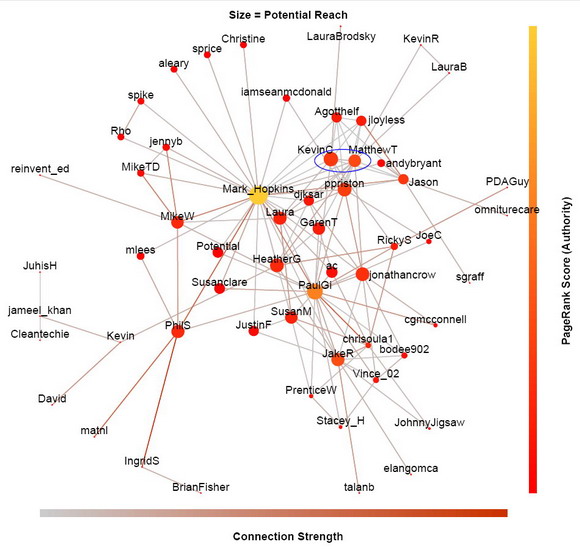
lithoSocGraph_reach+pageRank_resize.jpg

In this version of the social graph (above), I map the potential reach metric to the size of the dots, and the PageRank score to their color. Again, Mark_Hopkins has the greatest reach and the highest PageRankScore for the past month. But reach and authority is not always correlated either. For example, KevinC has greater reach than MatthewT in Lithosphere (KevinC is bigger dot), but MatthewT has higher authority than KevinC (MatthewT’s dot has more yellow tone).

I must emphasize that these ranking are only relevant for about a month window, because I have restricted the computation from 2010-03-05 to 2010-04-05. If we plot the social graph today, these node metrics could well be very different. So if you start participating more today, you may be one of the biggest and most yellow dots a month later.

Since Lithosphere is a pretty small community, most of these node metrics are quite well correlated. This will not be the case for larger communities. Therefore, depending on your marketing needs and constraints, you will need help from different kind of influencers in the community (see Are all Influencers Created Equal?).

Next week is our Lithium Network Confernece (LiNC2010). I will be there, so please come by and say hello if you will be attending. If not, we can always meet here at Lithosphere. Unless there are some special request at LiNC, I plan to show you some more social graphs from larger communities. But for now, I welcome any questions and comments as usual. See you next week at LiNC2010 or here at Lithosphere.


Lithosphere

Estadísticos y agrupamiento de grafo

Graph statistics and graph clustering
Participants : Daniel Archambault, Romain Bourqui, Maylis Delest, Frédéric Gilbert, Guy Melançon, François Queyroi, Arnaud Sallaberry, Paolo Simonetto, Faraz Zaidi.


Community detection in static networks
Searching of information on the web is a frequent task requiring some sort of organization to facilitate the searching process. Often this information is distributed, semistructured, overlapping and heterogeneous. Organization and structuring this information is an active area of research where the goal is to help users locate required information efficiently. Clustering is a well known technique to group similar information. Although often described as the unsupervised learning, clustering is quite trivial, as it often requires human intervention in terms of a number of parameters to guide the process. We address the clustering problem of web pages where the goal is to organize information to facilitate users for faster access to required information. In [30] We introduce a hierarchical fuzzy clustering algorithm to organize web pages. The algorithm uses a topological decomposition on the co-occurrence network of keywords to devise heuristics which help determine the input parameters for our clustering algorithm. Finally, we compare the results of the proposed algorithm with existing algorithms in the literature.

IMG/zaidi4
The exponential growth of data in various fields such as Social Networks and Internet has stimulated lots of activity in the field of network analysis and data mining. Identifying Communities remains a fundamental technique to explore and organize these networks. Few metrics are widely used to discover the presence of communities in a network. We argue that these metrics do not truly reflect the presence of communities by presenting counter examples. This is because these metrics concentrate on local cohesiveness among nodes where the goal is to judge whether two nodes belong to the same community or vise versa. Thus loosing the overall perspective of the presence of communities in the entire network. In [29] , we propose a new metric to identify the presence of communities in real world networks. This metric is based on the topological decomposition of networks taking into account two important ingredients of real world networks, the degree distribution and the density of nodes. We show the effectiveness of the proposed metric by testing it on various real world data sets.
IMG/zaidi5

Community detection in dynamic social networks

IMG/framework_overview


Figure 7Community detection in social networks – Framework overview

Detection of community structures in social networks has attracted lots of attention in the domain of sociology and behavioral sciences. Social networks also exhibit dynamic nature as these networks change continuously with the passage of time. Social networks might also present a hierarchical structure led by individuals who play important roles in a society such as managers and decision makers. Detection and visualization of these networks that are changing over time is a challenging problem where communities change as a function of events taking place in the society and the role people play in it. In [15] , we address these issues by presenting a system to analyze dynamic social networks (see Fig. 7 ). The proposed system is based on dynamic graph discretization and graph clustering. The system allows detection of major structural changes taking place in social communities over time and reveals hierarchies by identifying influential people in social networks. We use two different data sets for the empirical evaluation and observe that our system helps to discover interesting facts about the social and hierarchical structures present in these social networks.
In [35] we give the complete description of the graph decomposition algorithm used in [15] to generate overlapping clusters. The complexity of this algorithm is Im1 ${{O(|E|·de}g_max^2+{|V|·log(|V|)))}}$ . This algorithm is particularly efficient due to its ability to detect major modifications along dynamic processes such as time related ones.
IMG/result_decomposition_stable


Figure 8. Result of our decomposition algorithm on a subgraph of the "Hollywood graph" (actors graph) containing 421 movies. Our algorithm detected 404 of these movies.

Evaluation of clustering quality

Many real world systems can be modeled as networks or graphs. Clustering algorithms that help us to organize and understand these networks are usually referred to as, graph based clustering algorithms. Many algorithms exist in the literature for clustering network data. Evaluating the quality of these clustering algorithms is an important task addressed by different researchers. An important ingredient of evaluating these clustering techniques is the node-edge density of a cluster. We argue that evaluation methods based on density are heavily biased to networks having dense components, such as social networks, but are not well suited for data sets with other network topologies where the nodes are not densely connected. Example of such data sets are the transportation and Internet networks. We justify our hypothesis by presenting examples from real world data sets.
In [28] , we present a new metric to evaluate the quality of a clustering algorithm to overcome the limitations of existing cluster evaluation techniques. This new metric is based on the path length of the elements of a cluster and avoids judging the quality based on cluster density. We show the effectiveness of the proposed metric by comparing its results with other existing evaluation methods on artificially generated and real world data sets.
IMG/zaidi1


Figure 9Air Traffic Network Drawn using Hong Kong at the center and some airports directly connected to it.

In [33] , We design and study a multilevel modularity quality for clustered graphs, explicitly taking the nesting structure of clusters into account. Multilevel models appear crucial in the natural and social sciences. The multilevel modularity quality measure generalizes a modularity quality measure introduced by Mancoridis in the context of reverse software engineering. The measure we designed recursively traverses the hierarchy of clusters and computes a one variable polynomial encoding the intra and inter-cluster connectivity ratios appearing at all levels in a hierarchical clustering. The resulting polynomial reflects how the graph combines with the hierarchy of clusters and can be used to assess the quality of a hierarchical clustering. We discuss examples as proof-of-concept.


INRIA

Efecto de red a través de componentes gigantes

"Giant Components" Implies WInner-Takes-All in the Social Network Race

In graph theoretic social networking analysis, there's a concept known as "Giant Components". As the name implies, in any given human social network, there exists one main, extremely large, set of connected "nodes" (people) surrounded by significantly smaller, disconnected from the giant component, peripheral clusters of social networks.

This is illustrated qualitatively in "Networks, Crowds, and Markets" (free version here) by given the example: consider your current friend group, and who they're connected to, and so on. Ultimately, you'll find you're indirected connected to people from other countries. Another way to put it, if everyone has 100 (unique) friends, you very quickly get to large numbers of connected nodes (100 of your friends x (have) 100 friends x (who have) 100 friends x (who have) 100 friends x (who have) 100 friends = 10B people. However, there will be people, isolated on an island somewhere, that is not connected to the giant component.

Random Example (from here). You can see that a high proportion of nodes below to one connected cluster.
If any one person, in any one of the smaller clusters, becomes connected to the "Giant Component", the entire cluster is then considered part of the "Giant Component". So, it's reasonable to assume that, at some point, the desert island person will eventually meet one person in the giant component. It seems, in this connected world, we're almost fatalistically destined to be part of the giant component.

It is inevitable then, that we become part of the Facebook giant component, right? They're nearing 600 millions users, and check out this giant component.


In reality, things aren't as inevitable. It's not obvious initially, but a few things to consider:
  • The definition of the edges (connections between people) are a little more nuanced than simply "knowing" someone. What if you, instead of drawing a social graph based on Facebook-stated friendships, you drew it based on spending greater than 10 hours a day together? The graph would become much more fragmented.
  • Graphs can be used to represent different classes of social graphs. For example, and Facebook even does this, my family, and my coworkers could be represented as separate graphs. In other words, people are capable of belonging to multiple networks.
Both of these facts create an opportunity for emerging or niche social networks to evolve and grow -- and not necessarily at the expense of Facebook either! In retrospect, Livemocha, an interest-based social network, benefited from this.

Another example (or maybe a 3rd bullet is required above stating "cultural norms") is Mixi, a Japanese social network. Recently featured in the NYTimes, Facebook has been relatively unsuccessful in Japan. Some speculate it is cultural in nature; that the Japanese are more private and that Facebook's religious-like fervor towards unfettered openness doesn't resonate there. Allegedly, on Mixi only 5% of users use their real picture as an avatar.

The "giant component" question seems to simply be one of definition. Existentially, or environmentally, aren't we all connected?

As an aside, I'm taking a Social Media Analysis reading course this semester (similar to this one at Carnegie Melon). I have a weekly blog-writing assignment - this is the first post of many. 

Social Graph Paper

miércoles, 14 de noviembre de 2012

ARS: Análisis de la campaña online del NYT


Florida and Ohio: The deciding factors in the race to the White House

I have been using Condor to do Social Network Analysis for the last few weeks to get some insights into people's thoughts on Barack Obama and Mitt Romney. Since the race is so close, I was getting inconclusive results. Both candidates were equally popular and had very similar sentiments going for them.

This morning I saw a beautiful info graphic on The New York Times website that showed the various possible paths to victory for both the candidates depending on which swing states they could win. After playing around with it for some time I realized that if Romney loses Florida, he would need to win all the other swing states (8 of them) to get to the white house. Moreover, we also know that no Republican has ever won the presidential election without winning Ohio. So here's the bottom line: If Romney is to win the election he pretty much needs to win both Ohio and Florida.

Taking this into consideration, I thought I'd restrict my cool hunting to just Ohio and Florida today. I have collected twitter feeds referencing Obama and Romney from Ohio and Florida only using Condor's twitter collector and restricting the collection using geocodes. Here are the results,

Ohio

Following image shows the network of people talking about Romney and Obama

We can see that more people are talking about Obama than about Romney. i.e. in SNA terminology, Obama has a higher betweenness centrality.

The following image shows the sentiment analysis for Obama,

The dots above the 0 represent positive sentiment and those below the 0 represent negative sentiment. The sentiment is definitely slightly positive overall.

The following image shows the sentiment analysis for Romney,
Romney also seems to have a slightly positive sentiment overall.

Now lets look at what terms appeared in the tweets the most.

For Obama,
"vote", "voting" and "tomorrow" are the most prominent terms.

For Romney,
"vote", "voting", "voting" are prominent, but "jobs" and "republicans" are even more prominent. Are people talking about the auto bailout which saved jobs in Ohio? I am not sure. But if they are, then its good news for Obama.

I used Condor's taxo tool to look for terms pertaining to emotions that appeared in the tweets. Here's Obama's analysis,
Of all the terms that appear 22% are related to purely positive emotions (hope, love, compassion, victory, etc) and 12.8% are purely negative (disgust, fear, etc)

Here's Romney's analysis,
Of all the terms that appear 24% are related to purely positive emotions and 12% are related to purely negative emotions.

Conclusions:
* Romney seems to be doing a bit better than Obama in terms of emotions, but not by much.
* Overall Obama is more popular than Romney in Ohio.
* There is no clear winner still. But since Obama is more popular than Romney and their sentiment and emotion analysis are quite similar, I am predicting a close Obama victory.

Florida

I did the same analysis as above for Florida. Here is a summary of the findings,

* Obama is more popular on twitter than Romney in Florida as well.
* Both Obama and Romney have similar sentiment profiles, slightly leaning towards positive.
* The prominent terms in  Obama related feeds: vote, voting, voted, tomorrow
* The prominent terms in Romney related feeds: vote, voting, win, wins, lol.
* Obama emotion analysis: 23.7% positive, 12.3% negative
* Romney emotion analysis: 24.3% positive, 11.3% negative

Conclusions:
* Romney is again marginally better than Obama in terms of emotions.
* Overall Obama is more popular than Romney.
* Again, there is no clear winner. But since Obama is more popular, I am predicting a close Obama victory.

Bottom line: Since the race is so close, my predictions are only 50% accurate. At this point, popularity is the only differentiating factor between the 2 candidates on twitter. I am curious to see when all else remains equal, does popularity alone determine a candidate's chances of winning. We will find out soon. :-)

Following images were created from Florida's data, similar to those created for Ohio earlier in the post:

Popularity:
 Obama's terms:
 Romney's Terms:

Obama's Emotions:
Romney's Emotions:


martes, 13 de noviembre de 2012

Género en las redes sociales digitales

Study: Males vs. females in social networks
Have you ever wondered how many of Twitter’s users are women? Or men? What about Facebook, MySpace, Digg, LinkedIn, and other sites in the social media sphere?
We have tracked down this information for a number of social network sites (19 of them). All the major ones have been included, like Facebook, MySpace and Twitter and also some of the most popular social news sites; Digg, Reddit and Slashdot.
To determine the ratio between male and female users on these sites we used site demographics data for the United States gathered from Google’s Ad Planner service.

Male/female site user statistics

Before we move on to the chart, here are a few quick observations based on the results we got.
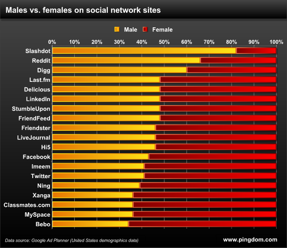
  • 84% (16 out of 19) of the sites have more female than male users.
  • The social news sites Digg, Reddit and Slashdot have significantly more male users than female. The standout here is Slashdot which takes male geekdom to new heights with 82% male users. :)
  • If we hadn’t included the three social news sites, all of the sites would have had more females than males.
  • Twitter and Facebook have almost the same male-female ratio; Twitter with 59% female users and Facebook with 57%.
  • The most female-dominated site? Bebo (66% female users), closely followed by MySpace and Classmates.com (64%).
  • The average ratio of all 19 sites was 47% male, 53% female.
And here’s a chart with the male/female ratio for all the sites, for your viewing pleasure:


Pingdom

Dime que edad tienes y te diré que red social usas

Study: Ages of social network users

How old is the average Twitter or Facebook user? What about all the other social network sites, like MySpace, LinkedIn, and so on? How is age distributed across the millions and millions of social network users out there?
To find out, we pulled together age statistics for 19 different social network sites, and crunched the numbers.
To get consistent age data for the various sites we used site demographics information for the United States gathered from Google’s Ad Planner service and then did some additional calculations to get all the data we needed.

Social network age distribution

What is the age distribution in the social media sphere?
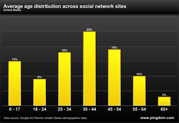
We took the age distribution data we had collected and calculated what the age distribution looked like across all 19 sites counted together. The resulting chart is right here below.
Average social network age distribution
A full 25% of the users on these sites are aged 35 to 44, which in other words is the age group that dominates the social media sphere. Only 3% are aged 65 or older.
That was the age distribution when looking at these 19 sites together. When looking at individual social network sites, the differences are significant, as you will see below.

Age distribution per site

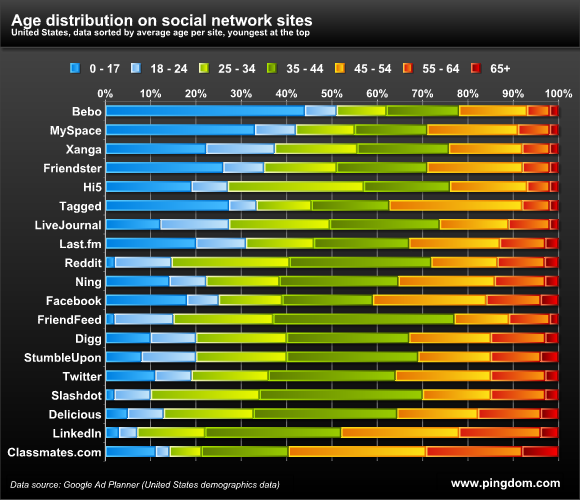
Here below you can examine the age distribution for each of the 19 social network sites we included in this study. The list has been sorted by the average user age per site (see further down for that), with the “youngest” site showing at the top and the “oldest” at the bottom.
Age distribution on social network sites
Some observations on age distribution:
  • Bebo appeals to a much younger audience than the other sites with 44% of its users being aged 17 or less. For MySpace, this number is also large; 33%.
  • Classmates.com has the largest share of users being aged 65 or more, 8%, and 78% are 35 or older.
  • 64% of Twitter’s users are aged 35 or older.
  • 61% of Facebooks’s users are aged 35 or older.

Dominant age groups

Most of the social networks we included are dominated by the age group 35-44, which was apparent in the first chart in this article. This group has become the most “social” age group out there. This is the generation of people who were in their 20s as the Web took off in the mid ‘90s.
If we look at which age groups are the largest for each site, we get the following distribution:
  • 0 – 17: Tops 4 out of 19 sites (21%)
  • 18 – 24: Tops no site
  • 25 – 34: Tops 1 out of 19 sites (5%)
  • 35 – 44: Tops 11 out of 19 sites (58%)
  • 45 – 54: Tops 3 out of 19 sites (16%)
  • 55 – 64: Tops no site
  • 65 or older: Tops no site
It’s a bit surprising that not one single site had the age group 18 – 24 as its largest, but that can be explained by this interval being a bit smaller than the other ones (it spans seven years, not 10 as most of the others). That the two oldest age groups don’t top any of the sites probably doesn’t surprise anyone, though.

Average user age per site

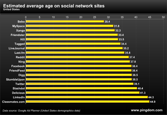
As we promised in the introduction, we have calculated an estimate of the average age for each of the social network sites included in this study. The result is here below.
Estimated average age on social network sites
A few observations:
  • The average social network user is 37 years old.
  • LinkedIn, with its business focus, has a predictably high average user age; 44.
  • The average Twitter user is 39 years old.
  • The average Facebook user is 38 years old.
  • The average MySpace user is 31 years old.
  • Bebo has by far the youngest users, as witnessed earlier, with an average age of 28.

On the social web, age is a factor

Although we can’t say how this will change over time, at the moment the older generations are for one reason or another (tech savvy, interest, etc.) not using social networking sites to a large extent. This probably reflects general internet usage, but we suspect the difference is enhanced when it comes to the social media sphere where site usage tends to be more frequent and time-consuming than usual.
It is also noteworthy that social media isn’t dominated by the youngest, often most tech-savvy generations, but rather by what has to be referred to as middle-aged people (although at the younger end of that spectrum).


Pingdom