sábado, 31 de agosto de 2013

viernes, 30 de agosto de 2013
Como activar el aporte de Granovetter en la realidad
Cómo hacer saber a su red que usted está buscando un trabajo
Alison Green - Business Insider

Si estás buscando trabajo, usted probablemente ha oído que una de las cosas más efectivas que puede hacer es utilizar la red de conexiones para encontrar pistas de trabajo y hacer conexiones con los directores de recursos humanos . Pero, ¿cómo realmente llegar a su red , y qué me dices? He aquí cinco claves para hacer las cosas bien .
1 . Póngase en contacto con las personas de forma individual , no en masa. Puede ser tentador para enviar un correo electrónico masivo , para que todos sepan de una vez que usted está buscando . Y siendo realistas, si esa es la única forma en que vamos a lograr que se haga , a continuación, hacer eso, porque es mejor que no ponerse en contacto con la gente en todos. Pero será mucho más eficaz si envía mensajes de correo electrónico individuales a las personas en lugar de un grupo de correo electrónico - porque la gente es generalmente mucho más dispuestos a ayudar cuando se sienten como si llegar a ellos directamente .
Después de todo , piensa en cómo te sientes en la piel similares : Si usted recibe un correo electrónico masivo a un amigo pedir a un grupo de personas que , por ejemplo, donar a una organización benéfica que está apoyando , que puede o no puede pasar mucho tiempo pensando acerca de su petición. Pero si ese amigo y no llega a usted personalmente , usted probablemente se sentirá más responsable para pensar realmente sobre la solicitud y tal vez actuar sobre ella. Cuando la gente ve que son uno de los muchos que se pide , hay una difusión de la responsabilidad , la sensación de que los demás van a tomar cuidado de esta , por lo que la urgencia se reduce. Así que si usted puede , haga correos electrónicos individuales - la gente se sentirá más invierten .

2 . Sea claro sobre exactamente lo que estás buscando. Con demasiada frecuencia , los solicitantes de empleo piden ayuda para buscar empleo sin estar claro acerca de lo que están buscando. No dejar nada abierto a la interpretación - Dices que estás buscando trabajo de forma explícita , y tener claro qué tipos de funciones usted está interesado.
3. Pregunte directamente qué tipo de ayuda desea. Cuando pide ayuda, no digas algo vago como " que me haga saber si usted oye hablar de nada " porque mucha gente no presta atención a ofertas de trabajo a su alrededor. En cambio, ser más específicos , las personas son mucho más propensos a ayudar si se les da algo concreto que pueden hacer. Por ejemplo , usted puede preguntar a su vecino si se puede conectar con un encargado que emplea en su anterior empresa , o puede pedirle a su antiguo jefe si le había asesorar sobre las compañías que está considerando. También puede pedir a la gente a pensar sobre si conocen a alguien que sería útil para que usted pueda hablar con , y decirles que usted estaría interesado en conectar con la gente , incluso si no hay una abertura adecuada en estos momentos.
4 . Póngase en contacto con todo el mundo en la red, incluso si usted no piensa que ellos saben de ofertas de trabajo adecuadas. Con demasiada frecuencia , los solicitantes de empleo no se atreven a llegar a la gente en su red a menos que sean de un director de recursos humanos o conectados a una empresa en particular con aberturas . Pero vale la pena llegar a la red completa, porque nunca se sabe quién puede ser capaz de decirle a usted acerca de una apertura para la que usted sería perfecto. (Y sus posibilidades de ser considerado para un puesto de trabajo a subir cuando tienes a alguien conectado con el trabajo diciendo: " Hey, realmente debería considerar Jane, porque ___ . ")
5 . No se olvide de incluir su currículum. A veces las personas piensan que es demasiado hacia delante o presuntuoso incluir su derecho currículum del palo y que deben esperar a ser preguntado ... pero en realidad, adjuntando su currículum se almacenan los contactos de tener que escribir de nuevo y solicitarlo. No sea tímido sobre el envío de la primera vez.
Alison Green - Business Insider
Si estás buscando trabajo, usted probablemente ha oído que una de las cosas más efectivas que puede hacer es utilizar la red de conexiones para encontrar pistas de trabajo y hacer conexiones con los directores de recursos humanos . Pero, ¿cómo realmente llegar a su red , y qué me dices? He aquí cinco claves para hacer las cosas bien .
1 . Póngase en contacto con las personas de forma individual , no en masa. Puede ser tentador para enviar un correo electrónico masivo , para que todos sepan de una vez que usted está buscando . Y siendo realistas, si esa es la única forma en que vamos a lograr que se haga , a continuación, hacer eso, porque es mejor que no ponerse en contacto con la gente en todos. Pero será mucho más eficaz si envía mensajes de correo electrónico individuales a las personas en lugar de un grupo de correo electrónico - porque la gente es generalmente mucho más dispuestos a ayudar cuando se sienten como si llegar a ellos directamente .
Después de todo , piensa en cómo te sientes en la piel similares : Si usted recibe un correo electrónico masivo a un amigo pedir a un grupo de personas que , por ejemplo, donar a una organización benéfica que está apoyando , que puede o no puede pasar mucho tiempo pensando acerca de su petición. Pero si ese amigo y no llega a usted personalmente , usted probablemente se sentirá más responsable para pensar realmente sobre la solicitud y tal vez actuar sobre ella. Cuando la gente ve que son uno de los muchos que se pide , hay una difusión de la responsabilidad , la sensación de que los demás van a tomar cuidado de esta , por lo que la urgencia se reduce. Así que si usted puede , haga correos electrónicos individuales - la gente se sentirá más invierten .

2 . Sea claro sobre exactamente lo que estás buscando. Con demasiada frecuencia , los solicitantes de empleo piden ayuda para buscar empleo sin estar claro acerca de lo que están buscando. No dejar nada abierto a la interpretación - Dices que estás buscando trabajo de forma explícita , y tener claro qué tipos de funciones usted está interesado.
3. Pregunte directamente qué tipo de ayuda desea. Cuando pide ayuda, no digas algo vago como " que me haga saber si usted oye hablar de nada " porque mucha gente no presta atención a ofertas de trabajo a su alrededor. En cambio, ser más específicos , las personas son mucho más propensos a ayudar si se les da algo concreto que pueden hacer. Por ejemplo , usted puede preguntar a su vecino si se puede conectar con un encargado que emplea en su anterior empresa , o puede pedirle a su antiguo jefe si le había asesorar sobre las compañías que está considerando. También puede pedir a la gente a pensar sobre si conocen a alguien que sería útil para que usted pueda hablar con , y decirles que usted estaría interesado en conectar con la gente , incluso si no hay una abertura adecuada en estos momentos.
4 . Póngase en contacto con todo el mundo en la red, incluso si usted no piensa que ellos saben de ofertas de trabajo adecuadas. Con demasiada frecuencia , los solicitantes de empleo no se atreven a llegar a la gente en su red a menos que sean de un director de recursos humanos o conectados a una empresa en particular con aberturas . Pero vale la pena llegar a la red completa, porque nunca se sabe quién puede ser capaz de decirle a usted acerca de una apertura para la que usted sería perfecto. (Y sus posibilidades de ser considerado para un puesto de trabajo a subir cuando tienes a alguien conectado con el trabajo diciendo: " Hey, realmente debería considerar Jane, porque ___ . ")
5 . No se olvide de incluir su currículum. A veces las personas piensan que es demasiado hacia delante o presuntuoso incluir su derecho currículum del palo y que deben esperar a ser preguntado ... pero en realidad, adjuntando su currículum se almacenan los contactos de tener que escribir de nuevo y solicitarlo. No sea tímido sobre el envío de la primera vez.
jueves, 29 de agosto de 2013
Grafo de enriedo en Oriente Medio
Grafo increíblemente convulsionado muestra justo como el Oriente Medio realmente es
Michael Kelley
The Big Pharaoh, el preeminente blogger egipcio, tweetió un grafo que intenta mapear las relaciones entre los diferentes grupos en el Oriente Medio.

Hay algunos temas con este grafo, alguno de los cuales fueron puntualizados por los lectores de Washington Post.
Business Insider
Michael Kelley
The Big Pharaoh, el preeminente blogger egipcio, tweetió un grafo que intenta mapear las relaciones entre los diferentes grupos en el Oriente Medio.
Como se puede ver, es un lío complicado. Las líneas rojas muestran que odia a los cuales, las líneas azules muestran que apoya a quién, y las líneas verdes muestran que no tiene ni idea acerca de un grupo.
- Israel podría estar técnicamente en guerra con Siria pero "no siente que pueda confiar en las fuerzas rebeldes dominadas por la minoría Sunni mucho más que lo confía en el regimen actual". Por lo que los enlaces de Odio/Apoyo para Israel representan una sobre simplificación.
- Debe haber un enlace de Odio que vaya desde Israel a Irán, e Irán, Hezbollah aliado libanés debe estar en la tabla.
- No hay flechas de odio que vayan hacia los EE.UU., que es probablemente un descuido.
- La facción de al-Qaeda vinculados a los rebeldes sirios también odia a los EE.UU., los chiítas del Líbano, Irán, Turquía, entre otros.
- Es engañoso decir que al-Qaeda odia a Arabia Saudita y los estados del Golfo dado que esos países, especialmente Qatar y Kuwait, han estado directa e indirectamente armando grupos radicales.
Business Insider
miércoles, 28 de agosto de 2013
La densidad de una red es independiente de su tamaño
The Density of a Network is Independent of its Size
I spent the last three years writing my PhD thesis. Since my thesis is about networks, I have used network datasets for research. Experimental results are more significant when done using multiple datasets and therefore I started collected network datasets. At first, I collected bipartite rating graphs such as MovieLens, Epinions and Netflix. Later I added social networks such as the Slashdot Zoo, Facebook and Flickr, hyperlink networks from Google, Wikipedia and TREC. Before my thesis was done, I noticed that I had collectedover a hundred network datasets!
My PhD thesis is about the spectral evolution model, but such a large collection of network datasets is much too interesting to use it just for that. Therefore, I decided to perform some statistics with the collection of network datasets, trying to reproduce well-known results about networks. One such result is that the density of networks is increasing over time.
Let me explain that: A network such as Facebook consist of nodes and links. In the case of Facebook, the nodes are users and the links are friendship links. We cannot know the complete Facebook network, but a part of it is available for research. What’s great about this dataset: Not only do we know the friends of each users, we also know the date at which each friendship link was added. This allows us to look at the changes in the network over time. For instance, one important statistic in a network is the average number of links connected to each node. This number is called the network density. A well known result about networks that change over time is that their density is increasing. In other words, the average number of friends people have on Facebook gets larger over time. This is not a trivial property: When a new user account is created, the average number of friends goes down, because new users don’t have any friends.
In other words, the larger the number of nodes in a network, the larger the density. This result was shown to be valid for individual networks, for instance in Jure Leskovec‘s dissertation. Given a large collection of datasets, we may now ask the related question: Is the number of nodes in a network correlated to the density, when comparing different networks? This question can only be answered with a large collection of datasets. Using the network datasets I have available, the result looks like this:
 Network size vs density for all networks
The result is: Network size and density do not correlate! In other words, the growing density is a feature of individual networks, not of networks as a whole.
This kind of result is kind of straightforward taken individually, but is only made possible when using a large collection of datasets! Therefore, me and my colleagues at theInstitute for Web Science and Technologies (WeST) at the University of Koblenz have decided to make the collection of datasets available in a form that makes it easy to do these kinds of studies. We will call the collection of datasets KONECT, short for Koblenz Network Collection. You can look at a poster of KONECT that we presented at the Web Science Conference that WeST organized in Koblenz a few weeks ago. We will also announce the KONECT web site soon—So stay tuned to this blog for more information!
NEW: All network datasets are available at KONECT – The Koblenz Network Collection
Here’s my PhD thesis:
Network size vs density for all networks
The result is: Network size and density do not correlate! In other words, the growing density is a feature of individual networks, not of networks as a whole.
This kind of result is kind of straightforward taken individually, but is only made possible when using a large collection of datasets! Therefore, me and my colleagues at theInstitute for Web Science and Technologies (WeST) at the University of Koblenz have decided to make the collection of datasets available in a form that makes it easy to do these kinds of studies. We will call the collection of datasets KONECT, short for Koblenz Network Collection. You can look at a poster of KONECT that we presented at the Web Science Conference that WeST organized in Koblenz a few weeks ago. We will also announce the KONECT web site soon—So stay tuned to this blog for more information!
NEW: All network datasets are available at KONECT – The Koblenz Network Collection
Here’s my PhD thesis:
On the Spectral Evolution of Large Networks, Jérôme Kunegis, PhD thesis, University of Koblenz–Landau, 2011.
I spent the last three years writing my PhD thesis. Since my thesis is about networks, I have used network datasets for research. Experimental results are more significant when done using multiple datasets and therefore I started collected network datasets. At first, I collected bipartite rating graphs such as MovieLens, Epinions and Netflix. Later I added social networks such as the Slashdot Zoo, Facebook and Flickr, hyperlink networks from Google, Wikipedia and TREC. Before my thesis was done, I noticed that I had collectedover a hundred network datasets!
My PhD thesis is about the spectral evolution model, but such a large collection of network datasets is much too interesting to use it just for that. Therefore, I decided to perform some statistics with the collection of network datasets, trying to reproduce well-known results about networks. One such result is that the density of networks is increasing over time.
Let me explain that: A network such as Facebook consist of nodes and links. In the case of Facebook, the nodes are users and the links are friendship links. We cannot know the complete Facebook network, but a part of it is available for research. What’s great about this dataset: Not only do we know the friends of each users, we also know the date at which each friendship link was added. This allows us to look at the changes in the network over time. For instance, one important statistic in a network is the average number of links connected to each node. This number is called the network density. A well known result about networks that change over time is that their density is increasing. In other words, the average number of friends people have on Facebook gets larger over time. This is not a trivial property: When a new user account is created, the average number of friends goes down, because new users don’t have any friends.
In other words, the larger the number of nodes in a network, the larger the density. This result was shown to be valid for individual networks, for instance in Jure Leskovec‘s dissertation. Given a large collection of datasets, we may now ask the related question: Is the number of nodes in a network correlated to the density, when comparing different networks? This question can only be answered with a large collection of datasets. Using the network datasets I have available, the result looks like this:

Network size vs density for all networks
The result is: Network size and density do not correlate! In other words, the growing density is a feature of individual networks, not of networks as a whole.
This kind of result is kind of straightforward taken individually, but is only made possible when using a large collection of datasets! Therefore, me and my colleagues at theInstitute for Web Science and Technologies (WeST) at the University of Koblenz have decided to make the collection of datasets available in a form that makes it easy to do these kinds of studies. We will call the collection of datasets KONECT, short for Koblenz Network Collection. You can look at a poster of KONECT that we presented at the Web Science Conference that WeST organized in Koblenz a few weeks ago. We will also announce the KONECT web site soon—So stay tuned to this blog for more information!
NEW: All network datasets are available at KONECT – The Koblenz Network Collection
Here’s my PhD thesis:
On the Spectral Evolution of Large Networks, Jérôme Kunegis, PhD thesis, University of Koblenz–Landau, 2011.
martes, 27 de agosto de 2013
Grafo de intereses
The Interest Graph


My boys will grow up to a world where work is radically different than what I’ve experienced in my life. The way they’ll coordinate their jobs with others will be much looser and “networky” than in our current organization-centric economy. One of the causes of this shift are changes in the way we find people who share our interests, so this article looks at the technology infrastructure for doing that.
Mapping Our Interests
Thanks to Facebook, most of us already know what a “social graph” is. It’s basically a map of the people you know. Build an Internet service around that graph and you get a social network like Facebook or Google+.
An “interest graph” is also a map, but instead of connecting us to people, it connects us to ideas. For example, among other things, I happen to be interested in business, networks, myth, and music by Michael Franti and Dead Can Dance. We can also look at some of my interests by mapping them on a simple interest graph:

Those lines illustrate my interest in these ideas – not my real-world connections to actual objects and people. The line between me and Thomas Jefferson, for example, shows my interest in what he represents, but (obviously) not the personal relationship you’d see in a social graph. Also, that connection to The Matrix says I’m interested in the movie, but nothing about whether I own a physical copy of it (we’ll leave that to the Internet of Things).
Software engineers are developing lots of different ways to build an interest graph. The most obvious is to simply ask people by allowing them to “like” and “plus” things online. There are also ways to infer our interests that are just as powerful, if a bit more tricky. For example, Google might interpret my search for “Thomas Jefferson” as a sign of potential interest in him; and that signal would get a lot stronger the more frequently I do it.
All this commenting, liking, searching and foraging for information on the web leaves our own unique little “pheromone trails” - while capturing of our interest graphs in the software of today’s Internet giants.
Mapping Our Meaning

When it comes to the interest graph, we really are talking about an interest in concepts – representations of people and things, rather than actual people and things. It’s this distinction that will connect our interests to the emerging semantic web, the next big evolution of the web, aimed at infusing meaning into text and other objects as a way to more easily automate connections between ideas.
There are lots of ways that these connections between ideas are formed, but one of the most promising centers on the way we humans interact with search technologies. When I search for “Benjamin Franklin,” “Monticello” and “Thomas Jefferson” around the same time, it suggests a meaningful connection between these terms, and the more people search for these terms together, the stronger that signal becomes.
Google tracks these semantic connections between ideas in what it calls the “knowledge graph“ - and surfaces them through the “people also search for” section of that box you sometimes see in your search results (see picture). The company is essentially using our searches to connect ideas and build its knowledge graph. That’s not the only way they’re doing it, but it’s a great strategy for them because it will be quite difficult for others to replicate.
By connecting ideas together in this way, Google will soon be able to help us discover interests we didn’t even know we had. I might not know I’m interested in Thomas Paine’s writings, simply because I don’t know about them, but Google knows I’m interested in Jefferson and that he’s semantically connected to Paine.
From a more commercial perspective, how about a search engine that knows that when I search for a nearby park, one of the activities people generally do in parks is have picnics? Given that kind of automated understanding, the search engine might show me ads of nearby delis and bakeries with ads tempting me to buy my picnic supplies. Revolutionary marketing? Not really. Any semi-creative marketer would have thought of that, except that, this wasn’t a marketer. It was a machine, and we’re now headed into a world where more and more of that creative insight will be automated by the semantic web.
Where this all gets really interesting though is when it gets connected to our interest graph.
Mapping Our Shared Interests
Some technology observers stretch the term “interest graph” to include other people who share our interests. I think this muddies the picture though. Just mapping people to their interests is a rich enough problem in its own right. We’ve barely scratched the surface here.
So, to get at this connection with others who share our interests, I like the term “shared interest graph” because it clearly states what it is: a map of people who share your interests.
At the most basic level, you use a shared interest graph in two ways: 1) finding new interests; and 2) finding new people.
When it comes to using the shared interest graph to find new interests, Facebook’s new Graph Search is a slick example. I’m still assessing how relevant my friends’ tastes in music, shows, and books really are to my own tastes. But it’s worth noting that one of my favorite musicians is Michael Franti, and he is at the top of my friends’ collective music list on Facebook.
As for using the interest graph to find new people, Facebook Groups and Google+ Communities are good, concrete examples. I run a “Good Business” community on Google+, which has helped me meet lots of people who share my interest in “business as a force for good in the world.”
With a shared interest graph, you can also combine finding new people and finding new interests. Music sites like Pandora show you lists of strangers who share your tastes in music. You can then visit their profiles to find new music that you also might like.
Opening Up the Shared Interest Graph
If none of this sounds particularly new or eye-opening to you, it’s because we’ve been working with aspects of the shared interest graph for a decade or more, even if most of us haven’t known quite what to call it.
Online retailers like Amazon were actually the pioneers in shared interest graph technologies. These companies used the shared interest graph as a kind of crowd-sourced personal shopper for suggesting products we might like based on what they knew of our tastes, and this gave them a powerful edge over traditional retailers.
These earlier pushes into the interest graph and the shared interest graph were all based on proprietary data standards. Amazon, for example, has very detailed data schemas for describing all kinds of products, which they have painstakingly built over the course of many years. I know a little bit about the difficulties here, having years ago run a product team at Microsoft that annually standardized vehicle specifications for all automobile makes and models available in the United States. It was a massive and messy job, and a source of considerable competitive advantage for our car buying service.
But this world of proprietary data schema is changing, thanks to the rise of the semantic web. Take a look at Schema.org, the collaboration between Google, Microsoft and Yahoo to standardize semantic descriptions of things like products,local businesses and many other things. These are fierce competitors, but they collaborate on this problem because they know that the semantic web and standardized schemas will greatly strengthen search operators at the expense of proprietary data masters like Amazon. It’s usually not a good idea to bet against Amazon, but if the semantic web builds sufficient momentum, it may well be forced to open up its product databases to future semantic search engines – or perhaps drastically shift strategies in order to become the semantic search engine itself.
What this means is that our interest graphs could become much more portable. Today, the music I’ve liked on Facebook can’t easily move with me to Google+ or Amazon. If the semantic web unfolds the way many believe it will, that could well change. It’s hard to imagine all this data commoditizing in ways that would enable that kind of portability – especially when you consider the power these players have today. But the history of industry shows that over time, businesses do commoditize – and the semantic web is likely to be a powerful force for that.
Remember too that the semantic web won’t just free our interest graphs from the proprietary data standards of online retailers, it will also help us build links between our interests and other ideas. Today, much of the way we use the shared interest graph is to connect to new interests – usually in the form of finding new products and services to buy. That’s understandable; shopping is where the money is, and software development efforts have flowed accordingly.
But this same infrastructure – the technology of the shared interest graph – has the potential to help us be much more than just better consumers. It has the potential to connect us with other people who share an interest and a stake in what we care about. And I’m betting that from these same seeds will grow something bigger, something that will affect the very nature of the way we work together.
lunes, 19 de agosto de 2013
Cómo los videos se hacen virales en Twitter
How Videos Go Viral On Twitter

How Videos Go Viral On Twitter (Twitter Blog) Twitter's UK research team found that there are no rules to "virality," as some spread like wildfire across the Web almost immediately, while others grow in a slow, but consistent manner. One thing is for sure, videos do increase engagement on Twitter: Brand tweets containing a video are 42% likely to be retweeted, replied to, or mentioned.
*Note: In the example at right, the blue nodes represent Tweets; the bigger they are, the larger the potential reach of that Tweet. The yellow dots represent retweets. In each case, reach takes into account not just followers, but also audience size and amplification by retweet. Read >
Facebook Makes Pages Viewed On Mobile Devices More Functional (TechCrunch)Following a redesign in April of Pages viewed on iOS and Android, Facebook has also improved its mobile site. The redesigned Pages come integrated with OpenTable to let users book restaurant reservations. If Facebook can make Pages more important to local businesses, it could become a threat to Yelp, Foursquare, and Google Search. Read >
Op-Ed: I'm 13 And None Of My Friends Use Facebook (Mashable) Ruby Karp, a thirteen-year-old living in New York, says her friends have accounts on Facebook, but they don't use the service because of the growing popularity of Instagram, Vine, Snapchat, and other social apps. "Part of the reason Facebook is losing my generation's attention is the fact that there are other networks now," said Karp. Read >

Pixability
Google+ Users Can Now Embed Music In Posts (SoundCloud via Google+) SoundCloud, a music sharing service, has integrated with Google+ to bring embedded songs to the social network. The partnership is the first third-party developer that Google+ has teamed up with for plug-in audio files. Read >
"It's Time To End Social Exceptionalism" (Forrester Blog) Forrester research analyst Nate Elliot argues that marketers are far too caught up in the idea of social media as the solution to all problems, and thus treat it as an island within itself. "But social messages that don't match the rest of your marketing
Business Insider
domingo, 18 de agosto de 2013
Los lugares más felices de USA según los tweets
The Happiest Places in America

After parsing the results from a recent University of Vermont study of geotagged tweets, theHuffington Post has compiled a map showing just how happy — or unhappy — Americans are according to the state they live in.
The numbers you see in the above graphic were derived by scoring more than 10,000 words on a positive-negative scale and measuring their frequency in millions of tweets across the United States.
Context was deliberately ignored to eliminate experimental bias, as were tweets from out-of-towners and/or tourists (which may explain why Hawaii rocked the list!).
Katy Hall and Jan Diehm explain their map and the 'word happiness score':
It turns out that Louisiana is the saddest state. "Socioeconomic factors that influence happiness in the U.S., such as poverty, unemployment and government resources, also account for some of the variation in life satisfaction levels in countries around the world," write Hall and Diehm.
Be sure to head on over to the HuffPo article to learn more — and to see how the U.S. stacks up with the rest of the world on the Life Satisfaction Index.
io9
After parsing the results from a recent University of Vermont study of geotagged tweets, theHuffington Post has compiled a map showing just how happy — or unhappy — Americans are according to the state they live in.
The numbers you see in the above graphic were derived by scoring more than 10,000 words on a positive-negative scale and measuring their frequency in millions of tweets across the United States.
Context was deliberately ignored to eliminate experimental bias, as were tweets from out-of-towners and/or tourists (which may explain why Hawaii rocked the list!).
Katy Hall and Jan Diehm explain their map and the 'word happiness score':
What emerged was significant regional variation in happiness by this calculation, which correlates with other lifestyle measures such as gun violence, obesity and Gallup'straditional wellbeing survey. A sadness belt across the South includes states that have high levels of poverty and the shortest life expectancies.
Geography is, of course, just one predictor of moods expressed on Twitter. The researchers also used their "hedonometer" to look at daily happiness averages over the past few years — and the peaks (holidays, especially Christmas) and valleys (tragedies including the Newtown shooting and Boston Marathon bombing) are not surprising.
It turns out that Louisiana is the saddest state. "Socioeconomic factors that influence happiness in the U.S., such as poverty, unemployment and government resources, also account for some of the variation in life satisfaction levels in countries around the world," write Hall and Diehm.
Be sure to head on over to the HuffPo article to learn more — and to see how the U.S. stacks up with the rest of the world on the Life Satisfaction Index.
io9
sábado, 17 de agosto de 2013
Efecto de red negativo, Facebook puede decrecer exponencialmente
Afirman que Facebook desaparecerá en tres años

“Cuando vaya cuesta abajo, será muy rápido”, dijo un experto. Clarín
El presidente de la Fundación de Software Libre de Europa (FSFE), Karsten Gerloff, afirmó que Facebook desaparecerá en tres años. El especialista dijo que las grandes empresas de tecnología le entregan información a los servicios secretos de las grandes potencias. Y la gente va a dejar de usar sus servicios.
“Si Google quiere sobrevivir a largo plazo, tendrá que reinventarse. Microsoft todavía no lo ha hecho. Por eso, creo que va a desaparecer dentro de cinco o diez años”, sorprendió Gerloff en una ponencia pronunciada en la Euskal Encounter, en Bilbao, España. El encuentro junta a miles de emprendedores tecnológicos, amantes de los videojuegos y público en general, se celebra cada año y ya va por la edición número 21.
Además, el especialista consideró que cuando Facebook “vaya cuesta abajo, será muy rápido. A Facebook le doy tres años. Es una ley matemática. Pasó con MySpace y sé que volverá a pasar”.
El experto alemán también se hizo tiempo para denunciar a varias empresas del sector. “Para Google y Facebook somos productos, no clientes” y alertó que esas mismas compañías de tecnología “sin ningún aviso previo, están nutriendo a los servicios secretos. Algunas corporaciones roban nuestra información. Nosotros no sólo les damos datos, sino también nuestra confianza, pues pensamos que van a proteger nuestra privacidad. Tus datos son el producto que vende Google”.
Gerloff añadió que estas multinacionales “han tomado nuestras computadoras, nuestras redes, y encima han creado estructuras de control”, y ha explicado que en este reparto de tareas “ Facebook define quiénes somos. Amazon establece lo que queremos y Google determina lo que pensamos ”. El presidente de FSFE ha calificado la situación actual de “traición”, y ha puesto como ejemplo “la entrega por parte de Yahoo! de información confidencial de sus clientes al Gobierno chino”. Y se lamentó: “Ahora lo hacen todos”.
El objetivo de la fundación que preside Gerloff es que “la gente sea consciente de que puede decidir cuál va a ser la tecnología de mañana y en qué tipo de mundo vamos a vivir”. Por ello, señaló que “siempre hay que estar alerta y observar los nuevos sistemas. Tienes que preguntarte: ¿Quién lo controla?”.
¿Cómo puede evitar los controles el usuario común? Gerloff explicó que se pueden hacer cosas muy sencillas. Por ejemplo construir sistemas “ que no tengan un punto central de control, en los que cada uno de nosotros hable con el otro. Eso ya no es una utopía”. Hay que animarse “a poner un servidor en cada casa. Los routers pueden funcionar como pequeños servidores”. De esta forma, ha dicho, “sería posible dar otros pasos, como salir de Facebook, o cambiar la cuenta de correo electrónico por otra de una compañía pequeña”.
viernes, 16 de agosto de 2013

jueves, 15 de agosto de 2013
La felicidad es acostarse... más que tus amigos
Happiness is…thinking you get laid more often than your friends
 SEXPAND
Sex makes us happy. More sex makes us happier. But a newly published study suggests that having more sex than we think other people are having makes us happiest of all.
In a recent issue of Social Indicators Research, sociologist Tim Wadsworth concludes that sex is a little like income*: the more of it people have, the happier they tend to say they are. By examining responses from more than 15,000 participants in the nationally representative General Social Survey, Wadsworth found that people who reported having sex regularly were more likely to report a higher level of happiness (on the rather amusing scale of "very happy, pretty happy or not too happy") than those who'd gone a year or more without any sex at all.
Survey participants who claimed to be having sex 2–3 times a month were 33% more likely to report higher levels of happiness. Participants having sex once a week were 44% more likely to report higher levels of happiness than those in the midst of a year-or-more dry spell. And those who reported having sex 2–3 times per week were 55% more likely to report higher levels of happiness. The numbers suggest that self-reported happiness tends to increase along with monthly nookie numbers.
But there's one big caveat: it's all relative. Wadsworth also found that self-reported happiness depended more on how much sex you thought other people were having than how much time you, yourself, were spending dancing the mattress jig. For instance, Wadsworth found that when people having sex thrice monthly believe their friends and peers are getting it on once a week, their probability of reporting a higher level of happiness falls by about 14%. If other words: if you think other people are having more sex than you, there's a chance it'll drag down your happiness.
“There’s an overall increase in sense of well-being that comes with engaging in sex more frequently, but there’s also this relative aspect to it,” said Wadsworth in a statement. “Having more sex makes us happy, but thinking that we are having more sex than other people makes us even happier.”
He goes on to concede that social comparisons may not be behind the effects he's observed, but that he "can't think of a better explanation for why how much sex other people are having would influence a person's happiness." After all, he says, we are social creatures. The vast majorities of our identities are defined within a social context.
Does this mean you should try to increase your happiness by trying to have more sex than your friends? Hardly. In fact, a better tactic might be to ignore their sex lives altogether.
The conflation of relative sexual activity with happiness (and the overarching social awareness that Wadsworth mentions), calls to mind a review co-authored in 2011 by Yale psychologist June Gruber, wherein she concludes that, when it comes to the pursuit of happiness, one of the best things you can do is stop trying to be happy.
Gruber and her colleagues explain that when you actively pursue happiness (making an effort to have as much sex or more than you think your peers are having, for example) "with the motivation or expectation that these things [you're doing] ought to make you happy," it can, paradoxically, "lead to disappointment and decreased happiness." The solution, then, is zen-like: to be happy, stop trying to be happy. Similarly, it seems that being less conscious of your sex life relative to the sex lives of others may be a more fundamental path to happiness than trying to keep up with the Jones' – and that's advice that extends well beyond the bedroom.
Wadsworth's paper, "Sex and the Pursuit of Happiness: How Other People's Sex Lives are Related to our Sense of Well-Being," is published in Social Indicators Research.
SEXPANDSex makes us happy. More sex makes us happier. But a newly published study suggests that having more sex than we think other people are having makes us happiest of all.
In a recent issue of Social Indicators Research, sociologist Tim Wadsworth concludes that sex is a little like income*: the more of it people have, the happier they tend to say they are. By examining responses from more than 15,000 participants in the nationally representative General Social Survey, Wadsworth found that people who reported having sex regularly were more likely to report a higher level of happiness (on the rather amusing scale of "very happy, pretty happy or not too happy") than those who'd gone a year or more without any sex at all.
Survey participants who claimed to be having sex 2–3 times a month were 33% more likely to report higher levels of happiness. Participants having sex once a week were 44% more likely to report higher levels of happiness than those in the midst of a year-or-more dry spell. And those who reported having sex 2–3 times per week were 55% more likely to report higher levels of happiness. The numbers suggest that self-reported happiness tends to increase along with monthly nookie numbers.
But there's one big caveat: it's all relative. Wadsworth also found that self-reported happiness depended more on how much sex you thought other people were having than how much time you, yourself, were spending dancing the mattress jig. For instance, Wadsworth found that when people having sex thrice monthly believe their friends and peers are getting it on once a week, their probability of reporting a higher level of happiness falls by about 14%. If other words: if you think other people are having more sex than you, there's a chance it'll drag down your happiness.
“There’s an overall increase in sense of well-being that comes with engaging in sex more frequently, but there’s also this relative aspect to it,” said Wadsworth in a statement. “Having more sex makes us happy, but thinking that we are having more sex than other people makes us even happier.”
He goes on to concede that social comparisons may not be behind the effects he's observed, but that he "can't think of a better explanation for why how much sex other people are having would influence a person's happiness." After all, he says, we are social creatures. The vast majorities of our identities are defined within a social context.
Does this mean you should try to increase your happiness by trying to have more sex than your friends? Hardly. In fact, a better tactic might be to ignore their sex lives altogether.
The conflation of relative sexual activity with happiness (and the overarching social awareness that Wadsworth mentions), calls to mind a review co-authored in 2011 by Yale psychologist June Gruber, wherein she concludes that, when it comes to the pursuit of happiness, one of the best things you can do is stop trying to be happy.
Gruber and her colleagues explain that when you actively pursue happiness (making an effort to have as much sex or more than you think your peers are having, for example) "with the motivation or expectation that these things [you're doing] ought to make you happy," it can, paradoxically, "lead to disappointment and decreased happiness." The solution, then, is zen-like: to be happy, stop trying to be happy. Similarly, it seems that being less conscious of your sex life relative to the sex lives of others may be a more fundamental path to happiness than trying to keep up with the Jones' – and that's advice that extends well beyond the bedroom.
Wadsworth's paper, "Sex and the Pursuit of Happiness: How Other People's Sex Lives are Related to our Sense of Well-Being," is published in Social Indicators Research.
*Before someone gets on my case about this: The relationship between money and happiness (like the definition of something like "happiness," in and of itself) is a contentious one. Some of the latest studies on money's role as a social and/or psychological determinant of happiness have shown that self-reports of happiness do appear to increase in line with annual income, but that the effects seem to peter out as you approach a given salary. A recent study out of Princeton put that figure at $75,000/year.
miércoles, 14 de agosto de 2013
¿Twitter puede predecir el proceso electoral estadounidense?
A New Study Says Twitter Can Predict US Elections
 While the Indiana University study examined House of Representatives and not presidential candidates, according to its findings, a tweet from John Boehner about Barack Obama would predict the election of... Barack Obama. (Reuters)
The more a candidate is mentioned on Twitter, the better. (After you control for a lot.)
The AtlanticWhile the Indiana University study examined House of Representatives and not presidential candidates, according to its findings, a tweet from John Boehner about Barack Obama would predict the election of... Barack Obama. (Reuters)
Political consultants, university sociologists, and amateur statisticians are now one step closer to using data from Twitter like they use polling data.
An Indiana University study has pulled, from the noise and muck of the stream, a statistically significant relationship between Twitter data and US election results.
Specifically, the study found a correlation between the number of times a candidate for the House of Representatives was mentioned on Twitter in the months before an election and his or her performance in that election. The more a candidate is mentioned on Twitter, the better.
Previous studies have found a loose relationship between activity on Twitter and financial or political events. A 2010 study found that certain ways of analyzing Twitter could foretell a film's success at the box office better than a prediction market for that purpose. In 2011, a German Ph.D. student correlated stock market performance to certain analytic variables on Twitter. At the same time, activists are often disappointed when chatter about a candidate on Twitter fails to translate to electoral victory, and there's a sense that Twitter has almost no relation to political success
This study is notable because it proposes a meaningful relationship between Twitter and American election results. "From the beginning, we were looking to construct simple and easy to operationalize measures of political behavior and attitudes that could be useful to social scientists," Joe DiGrazia, one of the researchers, wrote to me in an email.
The study specifically controlled for the conditions surrounding an election. If a candidate is an incumbent, they would be mentioned on Twitter more, so the study discounted their position. Likewise, the study also discounted candidates who the press covered more, using the number of times a candidate's name was mentioned on CNN as an imprecise measurement of mainstream media hype.
The study's finding bears a number of implications. First, it implies that all Twitter chatter is good Twitter chatter: that if more people are talking about you, you're likely to do better at the polls. Second, it provides a working model for predictive Twitter analysis in future elections, especially in the US. As Alex Roarty wrote at National Journal:
In [one of the study's researchers Fabio] Rojas's view, the findings should revolutionize how campaigns conduct themselves. Rather than spending hundreds of thousands, or even millions, of dollars on surveys, campaigns could simply gauge their status on Twitter. That should help campaigns with fewer resources compete with well-heeled incumbents, he said.
While I'm intrigued by the idea of a pesky challenger defeating a "well-heeled incumbent" without polling data, running on Twitter analysis alone, I suspect professional political Twitter analysts will pop up soon enough. Twitter already sells huge bulks of tweets to economic and financial consultants, who use the aggregate feed to predict the stock market; the company would be foolish not to make money off this capability in politics, too. Rather, what struck me about the study was that its researchers thought they could sidestep problems which plague polling data: People will tell pollers they plan to vote for the fashionable candidate, for instance, when they really intend on voting for someone else. I doubt that Twitter, inherently public and performative, avoids that bias.
At last count, eight percent of American adults use Twitter daily; only 15 percent are on it at all. The authors recognize this, yet their algorithms and data remain valid. So I wonder about the effects we'll see from work like this in the next decade or so, from the politicization and commercialization of the digital public sphere we've made, in which the journaling agglomerate can predict the future, in which our textual debates are machine-readable.
lunes, 12 de agosto de 2013
Integrando Google Spreadsheet con R para ARS de etiquetas
Increasingly I find myself creating Twitter hashtag archives using my TAGS Google Spreadsheet template as a means to identify who in that community has the most influence and ultimately use this intelligence to target people that might be able to help me disseminate my work. Marc Smith at the Social Media Research Foundation has a useful overview on ‘How to build a collection of influential followers in Twitter using social network analysis and NodeXL’.
I don’t go to the extreme of seeking people to follow and gaining influence with retweets, I usually just follow interesting people who follow me, but the post introduces the important concept of:
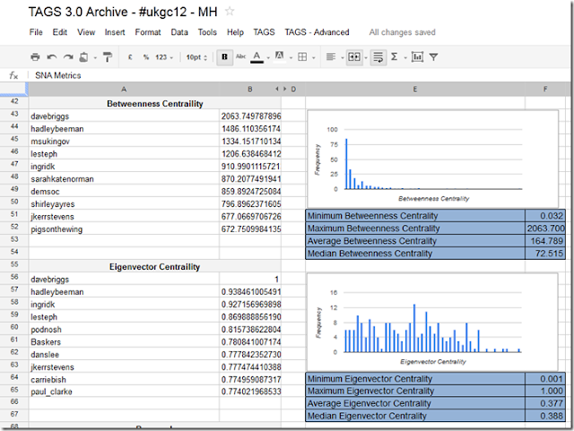
“betweenness centrality” – a measure of how much a person acts a bridge between others.
(betweenness centrality (BC) was a big turning point in my interest and understanding of social network analysis, a moment captured by Sheila MacNeill)
To date the only way I could calculate BC on an archive of tweets was to download the data to my desktop, run it through NodeXL and review the data. This isn’t ideal as the data becomes orphaned. I have experimented with calculating BC using Google Apps Script using a modified version of some PHP code put together by Jonathan Cummings, but kept hitting timeouts before I could get anything back.
I forgot about pursuing this angle until that is I saw Tony Hirst’s A Quick View Over a MASHe Google Spreadsheet Twitter Archive of UKGC12 Tweets in which he uses the statistical computing and graphing tool ‘R’ to read a spreadsheet of archived tweets and produce some quick summary views (I highly recommend you read this post and also check the contribution from Ben Marwick in the comments). Reading this post made me think if it is that easy to read and analyse data using R could you also not somehow push the results back.
Fortunately, and I do mean fortunately, I have no experience of R, R Script, R Studio (I like having no preconceived ideas of what new tools can do – it far more rewarding to throw yourself into the unknown and see if you make it out the other side), but I do know a lot about Google Apps Script giving me a destination – just no way of getting there.
The idea, I think, is ingeniously simple. Read data, as Tony did, process it in R and then using Apps Script’s feature to be published as a service to simply POST the data back to the original spreadsheet.
As that is quite complicated I’ll recap. Fetch a Google Spreadsheet as a *.csv, do something with the data and then push the data back in the same way that you post a web form (and if you skipped the link the first timePOST the data back to the original spreadsheet).
Having sunk a day of my own time (and it is my own time because I get paid for the OER Visualisation project for the hours I work on it), I’m not going to go into the details of how to setup R (or in my case RStudio) to do this – hey I learned it in a couple of hours so can you – instead I’ll give you the bits and pieces you need and general instructions. Before I start you might want to see if the result is worth it so here’s a sheet of SNA stats for the #ukgc12 archive.
Playing with some test data
To make it easier I start with a partially complete dataset. The scenario is I’ve got my archive and run options 1-3 in the TAGS – Advanced menu to get an Edges sheet of friend/follower information.
- Open this Google Spreadsheet and File > Make a copy (this is a fully functioning – if I haven’t broken it of the next version of TAGS so if you clear the Archive and setup you can start collecting and using this with your own data).
- Once you’ve copied select File > Publish to the web and publish the spreadsheet
- In the new spreadsheet open Tools > Script editor.. and Run > Setup (this get a copy of the spreadsheet id need to run as a service – in the normal scenario this is collected when the user authenticates the script with Twitter)
- Open Share > Publish as service.. and check ‘Allow anyone to invoke’ with ‘anonymous access’, not forgetting to ‘enable service’. You’ll need a copy of the service URL for later on. Click ‘Save’

- Back in the script editor on line 57 enter a ‘secret’ – this will prevent anyone from uploading data will in anonymous mode (you can choose to only enable the service when required for extra security.
- Open your install of R and load a copy of this script.
- There are four things to edit in this script
- key – spreadsheet key, the bit after https://docs.google.com/spreadsheet/ccc?key= and before the &hl… junk
- gid – the sheet number of the Edges sheet, unless you insert/use a different sheet should always be 105 for a TAGS spreadsheet
- serviceUrl – the url you got in step 4
- secret - the same secret you entered in step 5
- You might also need to install the packages used – most of them are standard but you may need to get igraph – used to get all social network data
- Run the R script – it may take some time to read a write to Google Spreadsheets so be patient
That’s it. If you go back to the spreadsheet (you may need to refresh) the SNA Metrics and Vertices sheets should be populated with data generated from R
The Apps Script Magic
Here’s the Google Apps Script snippet used to handle the data being pushed from R:
| 1234567891011121314151617181920212223242526272829303132333435363738394041 |
|
I’ve commented most of it so you can see what is happening. While Apps Script has a debugger which lets you monitor execution and variables it can’t intercept the POST so I used the original POST/GET code to dump the data into some cells then tweaked the script to read it from there to work out what needed to be done.
Final thoughts
I think this is a powerful model of reading selected, processing and then uploading data back to the source. I’m also only using the very basics of igraph and sure much more could be done to detect neighbourhoods, clusters and more. Also I wonder if more of the friendship data collection could be done in R with the TwitteR – (you R people really know how to make it hard to find info/help/support for your stuff ;) Right now I can get friend/follower info for a list of 250 users.
The intriguing aspect is just how much data can you push back to Apps Script and as there is a long list of Services could you also handle binary data like chart images (perhaps down the Blob and then Document Service route, or maybe just straight into Charts).
I welcome any comments you have about this technique and particularly value any feedback (I’m not a SNA expert so if there are errors in calculation or better measures I would welcome these)
Suscribirse a:
Entradas (Atom)